
Jump To
About
A design project from my Senior Capstone course at the University of Michigan that provide students the opportunities to participate in in-depth client works.
Purpose
Design a tailored solution to improve the learning experience for intermediate-advanced Mandarin learners.
Team
Ally(me), Ginny, Rebecca, Yuri, Sage
What I Did
Research: Interview, Survey, Affinity Diagram
Define: Persona, User Flow
Design: Sketches, Wireframes
Deliver: High-Fidelity Prototypes
Duration
5 months
Learning
User testing is essential throughout the design process.
Merging and meeting the needs of both the client and the users.
Background
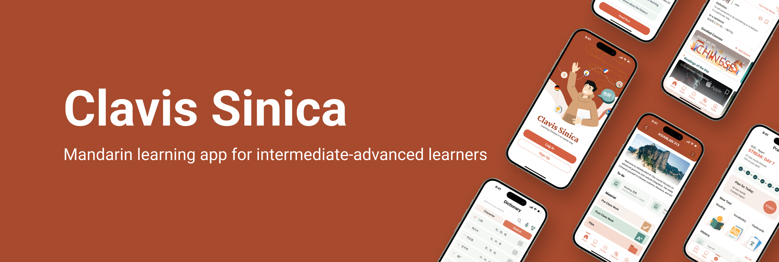
WHAT’S CLAVIS SINICA?
Clavis Sinica is a Chinese reading comprehension app created to aid intermediate - advanced students of Chinese; with features like an in-text dictionary, additional reading materials, and flashcard tools.
However, despite its potential, its UX and UI do not meet modern design standards and is now inaccessible due to the long beta stage.
CHALLENGE
With the majority of resources geared towards beginners, the intermediate to advanced Mandarin learners lack sufficient reading comprehension tools to enhance their learning process, hindering their ability to apply the language in diverse contexts and applications.
“How can we provide tailored & intuitive learning experiences for Mandarin learners, both individually and from UMich classes, and help them improve language application skill in diverse contexts?”


Solution
CORE EXPERIENCES
Homepage
Join Class
Course Material

Library Page - Culturally Integrated Lesson
Categorized reading materials along with two core features: “Upload” and “Archive”, complemented by “Pickup where you left off”
Upload page: Users can upload their own readings in various formats, ensuring flexibility in accessing external materials within the app
Archive feature: Functions as a cloud drive, allowing students to organize, search, and filter learning materials based on their preferences
Pickup where you left off feature: Allows users to seamlessly resume their learning

Practice Page - Interactive & Challenging Practices
Features personalized challenges and progress tracking to provide a gamified learning experience
Practice section: tracks the students’ learning progress throughout the week, gamifying the experience with streaks and reward badges
Users can complete daily exercises, review vocabulary & reading exercises, and access old tests
Options to customize quizzes by selecting question duration and style including “matching questions”, “speaking exercises”, and “fill in the blank”
Reading
Lookup Word
Toolbar
Homepage - Modern & Applicable Learning
Three main sections: “Word of the Day”, “Enrolled Courses”, and “Reading of the Day”
Suggest new words and readings based on user's profile
University of Michigan students can enroll in their Chinese classes using a unique code provided by their professors
Students will gain access to materials curated by their professors, while leveraging the resources available within the app
Library
Reading Detail
Upload
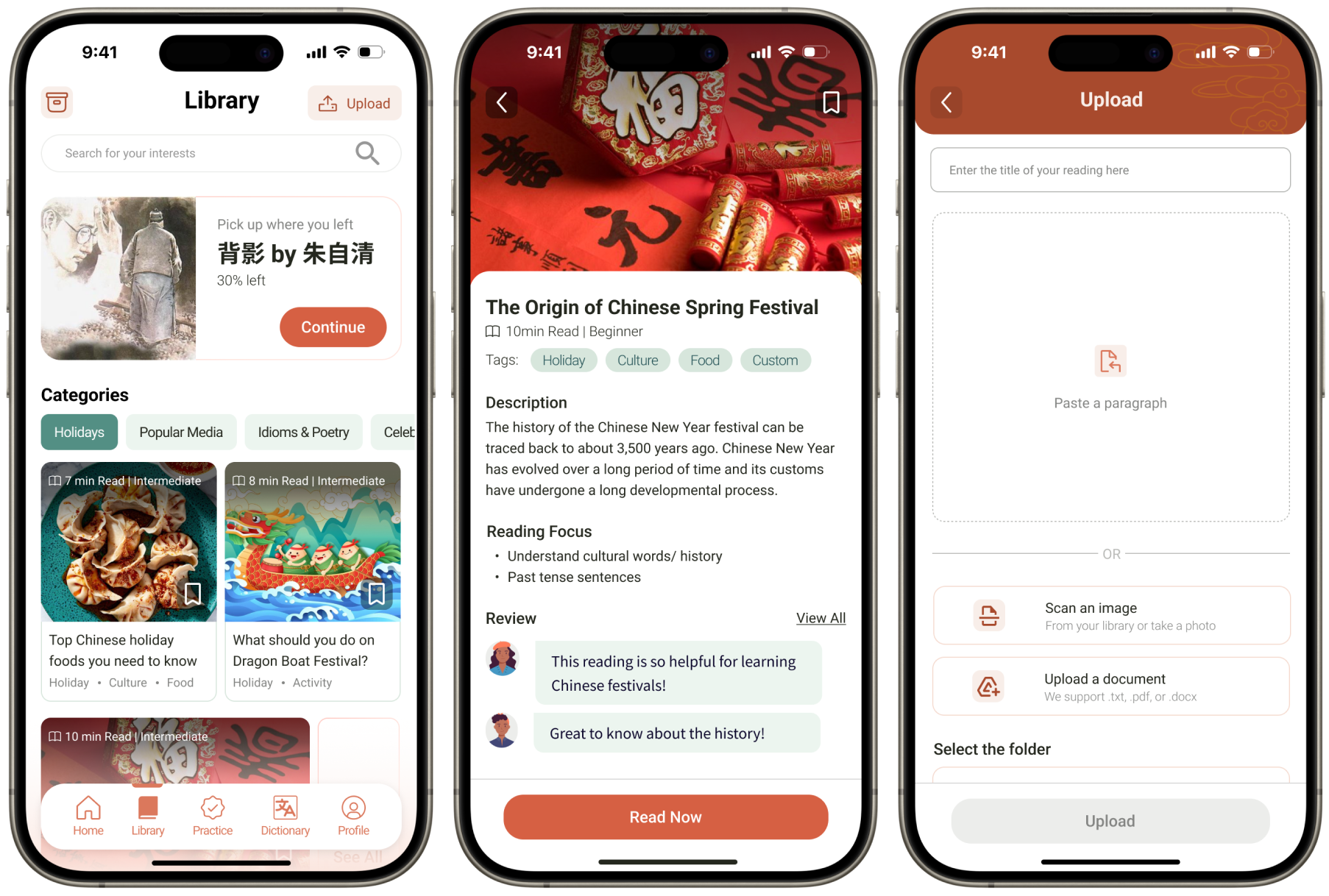
Reading Page - Mental Model-Based Tool
The Reading page allows users to read directly on the app with features such as “Lookup”, “Save”, and “Tool bar”
The vocabulary lookup feature allowing users to lookup details of the word such as definition, synonyms and word application with just a click
The tool bar provides customizable reading with features such as highlight, dark mode, and setting of the text size
Practice Page
Matching Questions
Order Sentences

How did we get here?
Research
UNDERSTANDING THE USER
What do the users need and prefer?
To understand the users pain points and perspectives, we conducted 10 in-depth user interviews with both the students and the instructors. we then analyzed the notes and generated the main insights with affinity diagram.

Define
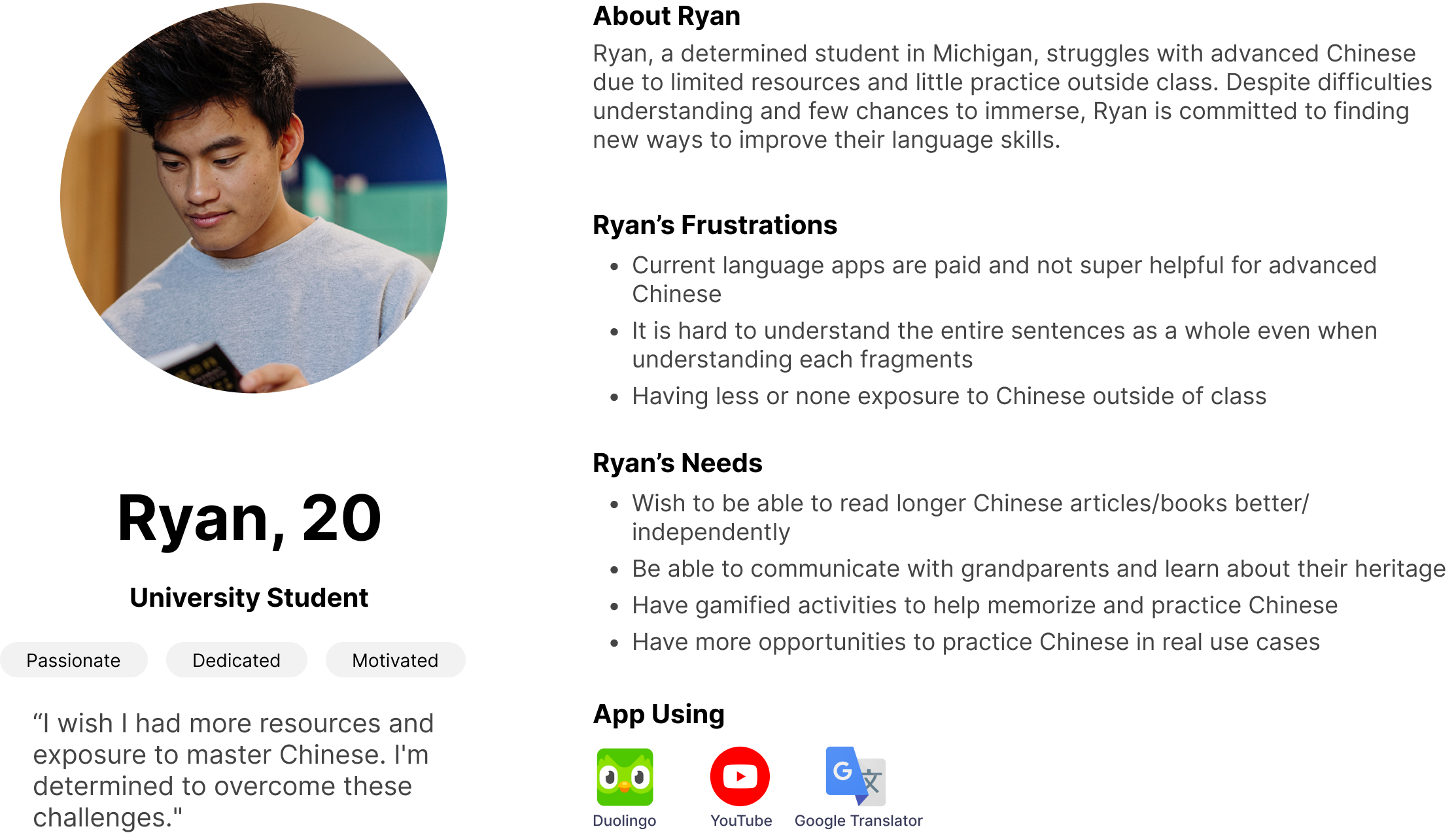
IDENTIFYING THE USER - PERSONA
Who are we designing the experience for?
To focus our design on meeting the users’ goals, we need to first identify who will be using our product. we utilized our input into a persona to represent our target audience for Clavis Sinica with their needs and goals.
USER FLOW
How do user navigate through the app?
To better define how users will navigate through the app including the steps they will need to take to complete a task and decision making of a step, the user flow provides detail steps for each of the main flows including Registration and Sign-in, Character Test, Analytic Dictionary, Vocab Flashcards, and Class Integration.

Design
SKETCHES & WIREFRAMES
Check out our design process from sketches to mid-fidelity wireframes.
The design began with a brainstorming session to generate initial ideas for the Clavis Sinica app features, in which each team member was asked to generate several sketches for a key screen, as shown below.

The design began with a brainstorming session to generate initial ideas for the Clavis Sinica app features, in which each team member was asked to generate several sketches for a key screen, as shown below.
The low-fidelity wireframes outlined the app's main features: Home, Library, Join Course, Reading, and Practice. These are considered essential based on UX research and requirements.


USER TESTING
How many steps do users need to take to complete a task?
To assess the effectiveness of our design, 5 user testing sessions were conducted on our mid-fidelity wireframes with a predefined scenario and list of tasks.


Deliver
KEY DESIGN DECISIONS
What are our reasonings behind the design choices and experience? What details did we include?
Customizable Learning Experience
One main thing that’s discovered during user research was the importance of customization. Users can make adjustments throughout the app to make their learning experience more personalized
Personalization
Setting up preferences for question structures allows users to learn in the most optimized way through tailored quizzes
Accessibility
Adjustable text size and margin, and the dark mode feature enhances accessibility such as contrast and readability
Intuitive Interaction/Navigation
After user testing, it is clear that users prefer the scrolling methods when reading as opposed to swiping left and right
User Mental Model
Adopting user’s mental model for webpage navigation and the new word look-up feature, the scrolling and pop-up designs ensure intuitive interactions through the reading process
Instruction for New Users
Providing instructions to guide first-time users navigating the feature
Takeaway
What did I learn?
I am Not the User
As a designer it is easy to assume scenarios for the users but an effective product comes from real user feedback and iterative user testings
Effective Team Collaboration is Key
Sometimes working in a team can be harder than working alone due to lack of communication and disagreements, but effective communication and optimized skill distribution will lead to high-quality work
Balancing Client’s and User’s Needs
Client’s needs might not always align with what’s best for the users or what they prefer. As a UX designer (and researcher), I play a crucial role in finding balance and bridging the gap between the two