AURORA PREMIUM
Edenspiekermann Design Challenge
Jump To
A design challenge provided by Edenspiekermann to a course at the University of Michigan that gave student a chance to craft automotive digital experience
About
Purpose
Design intuitive and personalized user experience for drivers and passengers with logical information architecture
Team
Individual Project/ UX Designer
Research: Competitive analysis
Define: Persona, Information Architecture
Design: Wireframes
Deliver: High-fidelity prototypes
What I Did
Duration
8 weeks
Personalization plays a big role in creating an unique experience for the riders, and simple and straightforward user flow and screen design are crucial for the drivers
Learning
Aurora is a fictional new EV startup with the vision of bringing a volume SUV to the market. Luxury EV owners want a car that not only take them to places but offer ultimate user experience that tailored convenience, comfort, and most importantly personalization.
Background
CHALLENGE
“How can we optimize design concepts and organize contents to improve the digital user experience in vehicles to provide drivers an unique in-car experience?”
Solution
CORE EXPERIENCES
Navigation
Climate Control
Music
Dropdown Page & User Profile
Dropdown Menu
Drivers can customize and access their favorite app widgets to be presented on the dropdown menu such as weather or calendar app
User Profile
User preferences of each profile include seat and mirror adjustments, seamless connection to Google and music account, etc
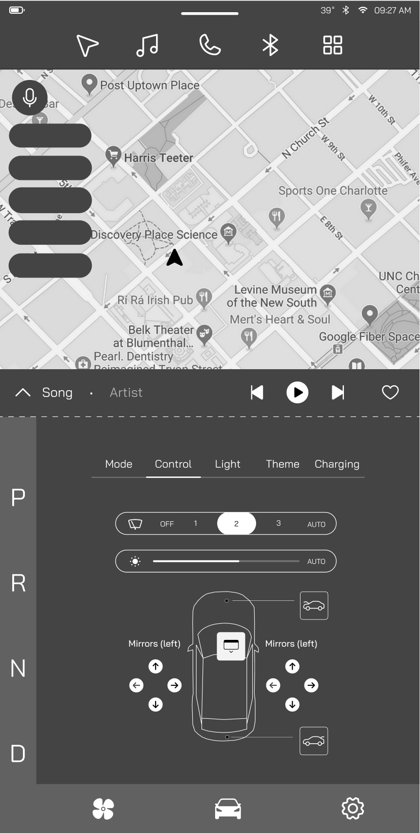
Vehicle Control
Upper Section (Apps)
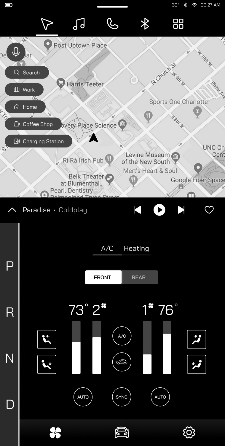
The upper section of the screen provides main features including navigation and music and other in-car apps.
Navigation page is set as default and the main page with frequent-destination shortcuts allowing drivers to always be ready to hit the road
Display music shortcut on the main page at all time
Navigation bar is designed to be on the top of the screen to provide easy access for the driver while preventing misclicking from the shortcuts
Dropdown Menu
User Profile
Lower Section (Controls)
The bottom section of the screen provides most of the features that are related to the controls in vehicle.
Climate control is separated between A/C and Heating to reduce driver’s cognitive load
PRNDL bar is available on the left side of the bottom screen, closer to the driver, for better accessibility
Vehicle control feature such as mirror adjustments are designed to mimic physical buttons to reduce driver’s learning curve
Research
COMPETITIVE ANALYSIS
How do other luxury brands design their climate control?
Organizing the information in climate control was one of my biggest challenge. To understand how the designs are currently being applied in other brands, I looked at some of Aurora’s direct competitors. I found that many luxury EV brands provides clear separation between the driver and the passenger. Meanwhile features such as auto and sync reduce the steps users have to go through when controlling climate setting.
Define
IDENTIFYING THE USER
To focus my design on meeting the users’ goals, we need to first identify who will be using our product. I created a persona to represent my target audience for Aurora Premium with their needs and goals.
Who are we designing the experience for?
INFORMATION ARCHITECTURE
How should we group the contents so they are intuitive and easy to find?
Information architecture is especially important for screens in cars because drivers need to complete tasks effectively and efficiently both on and off the road. With so many information and features available to the drivers and passengers. I need to make sure the contents are organized in a user-friendly manner so they can navigate and interact with the screens intuitively.
Design
SKETCHES & WIREFRAMES
Check out my design process from sketches to mid-fidelity wireframes.
During the ideation phase, I did a couple sketches to test out some layouts, and then I tried to implement the layouts to low-fidelity wireframes using Figma.
Sketch
I was able to receive valuable feedbacks from UX professionals from the automotive industry. I made a lot of changes from low-fidelity wireframes (initial) to mid-fidelity wireframes (final) based on the feedback:
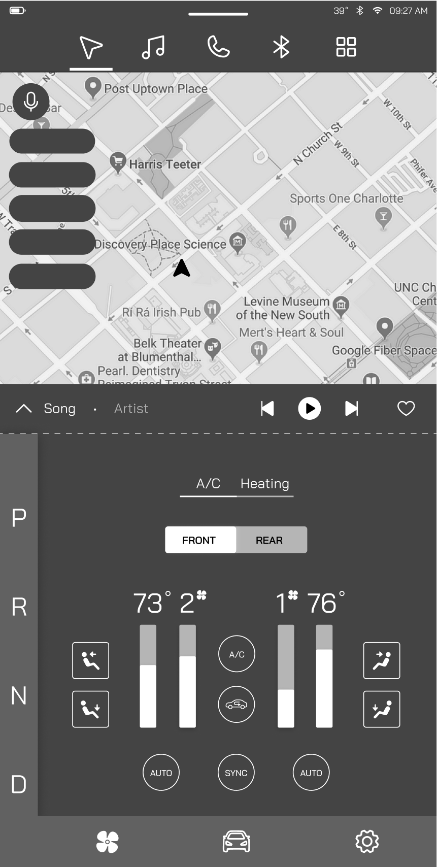
Re-designed top page for better accessibility (move widgets to dropdown menu and make navigation the whole screen/main page)
Re-organized bottom page (HVAC & Vehicle control sections) to improve information architecture
Re-designed PRNDL section for better accessibility (available all time instead of collapsing and expanding)
Initial Design Layout
Final Design Layout
Deliver
KEY DESIGN DECISIONS/ HI-FI PROTOTYPES
What are my reasoning behind the core experiences? What detail did I add?
Enhance User Experience w/ Micro Interaction
Temperature Adjustment
Micro interactions in climate control systems include smooth transitions and animations when adjusting the temperature to provide better feedback, making the experience more engaging and informative
Drivers can easily slide the bars through long/hard pressing for faster and more accurate adjustments
Evaluate Convenience & Customization
Customized Dropdown Menu
The dropdown menu provides useful information when needed while conserving space for other essential features/app on home page
Widget features like weather and calendar app provide helpful information and save driver time
User Profile
User profile automatically saves the user’s driving preferences provide them an ultimate personalized experience and be ready to hit the road anytime
Examples of driving preferences can include seat adjustments, music account, vehicle controls, etc
Reduce Cognitive Load
Climate Control
The climate control system is separated into two main sections between the A/C and Heating. This reduces driver’s cognitive load by the only showing part of the necessary features to prevent overwhelming the driver with excessive information all at once
The improved grouping and information architecture provides faster reaction time by reducing the time that driver needs process information and find specific feature on the screen to keep driver’s eyes on the road for a safer travel
Upper & Lower Screens
The screens are separated into upper and lower section where features such as map & music apps are grouped into the top section and features such as, PRNDL, HVAC and vehicle controls are grouped into the lower section. The separation makes the process more intuitive while the driver navigates through different kinds of features
Takeaways
What did I learn?
Never limit yourself!
I have never thought that I would be interested in automotive design, but ended up enjoying the process. I was debating to take the course and glad I did. The experience has introduced me to a new field, and I can totally see myself doing more!
Good design takes several iterations
I had no prior knowledge about automotive ux design before the course. However, when I was learning and designing for the project I realized that the ux principle and design process that I knew from mobile and desktop design applied almost the same way to car screens. The most important part always comes down to the users no matter the display.
Just do it
I think there’s no better way to phrase this. In the beginning I was struggling to generate ideas. However, once I started sketching out the ideas and turned them into wireframes on Figma, more ideas came up. Sometimes the hardest part of design is to just “start”.


